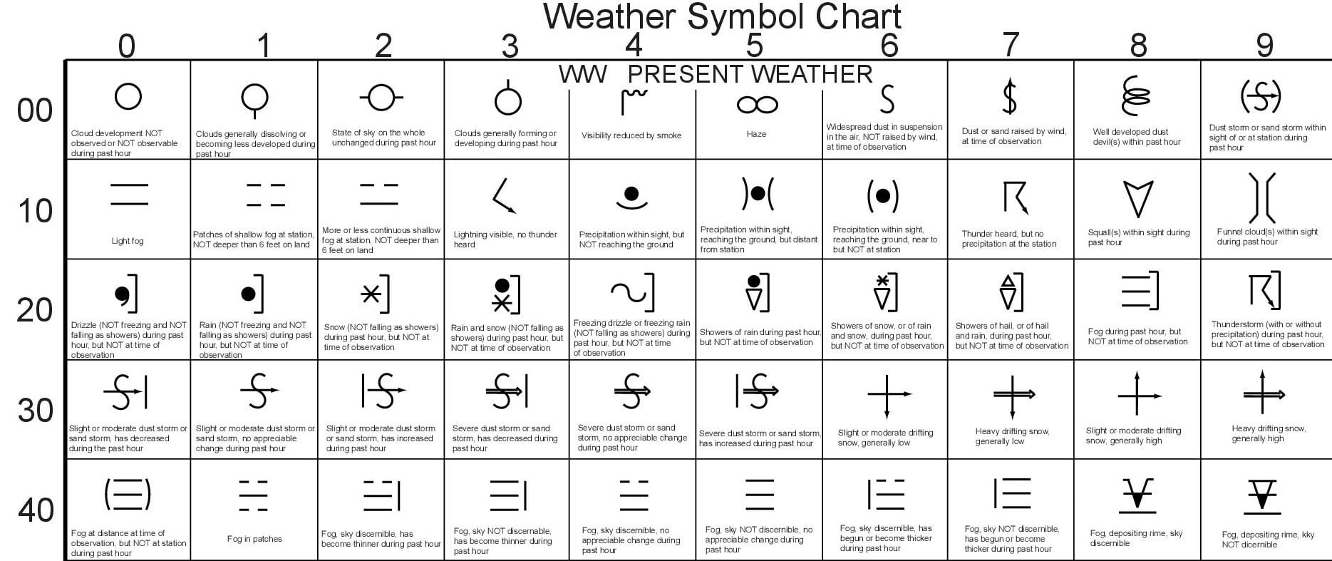
Weather Symbols used on Weather Charts & Maps
Geography Practical
Index
Weather Charts
Weather charts are graphical representations of meteorological data used to analyse and predict weather conditions. Symbols are an essential part of weather charts, and they convey information about various meteorological elements.
Symbols used to Represent Air Fronts and Cyclones
Air fronts and cyclones are often represented using various symbols on weather maps.
The commonly used symbols:
Cold Front:
A cold front is represented by a solid blue line with blue triangles pointing towards the warmer air mass it is advancing into. The triangles are usually drawn along the line at regular intervals.
Warm Front:
A warm front is depicted by a solid red line with red semicircles pointing towards the colder air mass it is approaching. These semicircles are usually drawn along the line at regular intervals.
Occluded Front:
An occluded front is shown by a purple line with alternating triangles and semicircles. The triangles represent the advancing cold air, while the semicircles represent the retreating warm air.
Stationary Front:
A stationary front is represented by an alternating series of blue triangles and red semicircles along a solid line. The triangles indicate the cold air mass, while the semicircles represent the warm air mass. The line connecting them is usually not as prominent as in other fronts.
Cyclone:
Tropical Cyclone:
A tropical cyclone, also known as a hurricane or typhoon, is indicated by a circle with a dot in the centre and curved lines extending outwards. These lines depict the spiral rainbands associated with the cyclone. The circle is sometimes shaded or filled to represent the eye of the storm.
Mid-latitude Cyclone:
A mid-latitude cyclone, often referred to as a low-pressure system, is represented by a circle with a line extending from it in the direction of movement. This line is called a "tail" and indicates the direction of the cyclone. The line may have triangular points along its length to indicate the frontal boundaries associated with the cyclone.
It's important to note that different weather charts and meteorological agencies may use slightly different variations of these symbols, but the basic concepts and representations remain consistent across charts.
Symbols used to Represent Cloud Coverage
In weather charts, cloud coverage is often represented using symbols that provide a quick visual indication of the amount and type of clouds present in a particular area. These symbols are standardized to ensure consistency and clarity in weather reporting.
Some commonly used symbols for cloud coverage:
Clear Sky: [Symbol 0]
A clear sky is typically represented by a circle or a blank space on the weather chart. It indicates that there are no clouds present, and the sky is completely clear.
Partly Cloudy: [Symbol 1, 2, 3]
This symbol represents a sky with a mixture of clouds and clear areas. It is usually depicted as a combination of clear sky and a cloud symbol, indicating that there are some clouds in the sky, but they are not completely covering the sun.
Scattered Clouds: [Symbol 4, 5]
Scattered clouds are depicted by a few cloud symbols with visible clear areas in between. This indicates that there are isolated clouds present but not enough to significantly obscure the sun.
Mostly Cloudy: [Symbol 6, 7]
The mostly cloudy symbol shows a sky where a significant portion is covered by clouds. It is represented by layer of cloud symbols i.e., clouds are covering a large portion of the sky, leaving minimal clear areas visible.
Overcast: [Symbol 8]
The overcast symbol represents a sky that is completely covered with clouds (cloud cover greater than 90%). It is depicted as a solid layer of cloud symbols without any visible clear areas. This indicates a significant absence of sunlight and is often associated with gloomy and rainy conditions.
Obscure Sky: [Symbol 9]
The symbol commonly used in weather charts to represent an obscured sky is a cross line, filled-in circle. This symbol indicates that something is blocking both the view of the sky and the clouds. This could be dust, haze (pollution), smoke, volcanic ash or even heavy rain or snow.
Symbols used to Represent Different Types of Precipitation
Precipitation is simply any form of water particles (regardless of their state that forms up in the atmosphere) that falls to the ground, i.e., liquids or solids (that be snow, hail, sleet or ice).
Rain and Drizzle
Rain and drizzle are precipitation in the form of liquid drops. In this case, these are differentiated on the basis of the size of the drops. Drizzle drops tend to be small, falling much slower than rain. On the other hand, rain drops are bigger and fall slightly faster.
any drop which has a diameter of 0.5 mm or less, is generally considered to be drizzle while larger than that is considered to be rain.
Words like 'intermittent', 'continuous' and 'widespread' are often used to describe rain.
Showers
Showers can either be in liquid or solid form and hence, one can have rain showers, snow showers and even hail showers (most commonly known as hail storms). Showers tend to start and end more suddenly and do change in intensity as well.
Weather charts often utilize symbols to represent different types of precipitation. These symbols allow meteorologists and weather enthusiasts to quickly interpret and understand the current or forecasted weather conditions.
Some common symbols used to depict various forms of precipitation:
Drizzle: [Symbol 5]
difference between drizzle, rain and shower
Drizzle is depicted by large/solid inverted comma. This symbol often appears to indicating light and misty precipitation.
Rain: [Symbol 6]
The symbol for rain is a large/solid dot. This resembles falling raindrops and is typically shown in dark black colour. The number of drops can vary to indicate the intensity of rainfall.
Showers: [Symbol 8]
Showers are represented by a symbol of inverse triangle. This symbol signifies a more intermittent or scattered pattern of rainfall compared to steady rain.
Snow: [Symbol 7]
The symbol for snow consists of scattered asterisks. These asterisks are usually coloured white to represent snowflakes. The density of the dots can indicate the snowfall intensity, with a higher density representing heavier snow.
Thunderstorm [Symbol 9]
The symbol commonly used to represent a thunderstorm is a lightning bolt. This symbol is often depicted as a jagged lines representing the lightning. It is widely used in various weather maps and signage.
Snow Showers:
Snow showers are characterized by light to moderate snowfall, usually lasting for a short duration. Snow showers can create a thin layer of snow on the ground and may cause reduced visibility, making travel conditions challenging.
Similar to snow, snow showers are represented by a combination of snow and shower symbols. This symbol indicates intermittent or short duration snowfall.
Sleet:
Sleet is a type of precipitation that falls as a mixture of raindrops and ice pellets. It occurs when snowflakes partially melt as they fall through a layer of warm air and then refreeze before reaching the ground.
Sleet, which is a mixture of rain and snow, is typically shown using a combination of rain and snow symbols.
Hail:
Hail is a form of precipitation that consists of solid ice pellets. It is formed when thunderstorms carry raindrops upward into extremely cold areas of the atmosphere, causing them to freeze.
Hail is symbolized by a small triangle. These triangles may be filled or empty, depending on the condition.
Here is a different combination of symbols to represent various precipitation types;
Symbols used to Represent Wind
Here is a description of symbols used in weather charts for wind and different types of wind.
Wind Direction:
The wind direction is represented by an arrow pointing in the direction from which the wind is blowing. The arrow originates from a circle, which indicates the location of the weather station.
Wind Speed:
The wind speed is indicated by feathers or barbs on the wind direction arrow. A short line or barb represents a speed of 5 knots, and a long line or flag represents a speed of 10 knots. Each full pennant represents 50 knots, and each half pennant represents 25 knots. For example, three long lines and a half pennant would indicate a wind speed of 35 knots.
Calm Wind:
When there is no significant wind, a circle with a dot in the center is used to represent calm wind conditions.
Gusts:
If there are gusts in addition to the sustained wind, a small curve or flag is added to the end of the wind speed barb. This indicates a sudden increase in wind speed.
Symbols used to Represent Visibility
Here are some common symbols used to represent visibility on weather charts:
Clear Visibility:
This is represented by a symbol with a circle, indicating excellent visibility with no obstructions or significant atmospheric particles.
Haze:
Haze refers to the presence of fine dust, smoke, or other suspended particles in the air, which can reduce visibility. It is typically depicted by ![]() symbol.
symbol.
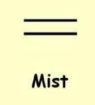
Mist:
Mist occurs when there are tiny water droplets suspended in the air, reducing visibility but not as significantly as fog. It is depicted by two horizontal lines.
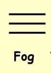
Fog:
Fog is a dense cloud of tiny water droplets that forms near the ground, severely limiting visibility. It is represented by a series of lines.
Smoke:
Smoke is often associated with fires and can significantly reduce visibility. It is depicted by thick, wavy lines extending from straight line. Visibility reduced by smoke is represented by 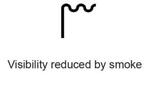 symbol.
Dust/Sandstorm:
Dust or sandstorms occur in arid regions when strong winds lift and carry particles of dust or sand, reducing visibility to very low levels. This is represented by 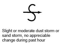 symbol.
Blowing Snow:
Blowing snow happens when strong winds lift snow from the ground, causing reduced visibility. It is depicted by a symbol with 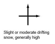 .
.
Weather charts typically use a variety of symbols to represent different types of rainfall.
Also read this -
Isolines
Isolines are lines on a weather map that connect points of equal value of a particular weather variable. They are commonly used to represent and visualize different weather phenomena.
Some of the different Isolines used in Weather Maps:
Isobars:
Isobars are lines connecting points of equal atmospheric pressure. They help meteorologists identify areas of high and low pressure. These are important for understanding wind patterns and weather systems. Isobars that are close together indicate strong pressure gradients and strong winds, while widely spaced isobars indicate weaker winds.
Isotherms:
Isotherms are lines connecting points of equal temperature. These lines are used to illustrate temperature variations across a geographic area. Isotherms allow meteorologists to identify regions of warm and cold air masses, as well as temperature gradients. Close spacing between isotherms indicates a steep temperature gradient, while widely spaced isotherms indicate a more gradual change in temperature.
Isohyets:
Isohyets are lines connecting points of equal precipitation or rainfall amounts. These lines help meteorologists to visualize areas of varying rainfall intensity or accumulated precipitation over a specific time period. Isohyets are commonly used to map rainfall patterns, identify areas of heavy rainfall or drought.
Isodrosotherms:
Isodrosotherms are lines connecting points of equal dew point temperature. The dew point is the temperature at which air becomes saturated, leading to the formation of dew or fog. Isodrosotherms are useful for identifying areas of high humidity and moisture content, as well as regions prone to fog formation.
Isotachs:
Isotachs are lines connecting points of equal wind speed. They are used to illustrate the distribution and intensity of wind across a geographic area. Isotachs can help identify regions of high wind speeds, such as jet streams or areas affected by strong winds associated with weather systems.
Isopleths:
Isopleths represent lines connecting points of equal values for a specific meteorological variable, such as wind speed, relative humidity, cloud cover, or snowfall depth. Isopleths help in understanding spatial variations of these variables and their gradients across a region.
These are a few examples of the isolines commonly used in weather maps. Each isoline provides valuable information about different weather parameters, allowing meteorologists to analyse and forecast weather conditions more effectively.
Probable Questions
Ans : Isobars are isolines on a weather map that connect points of equal atmospheric pressure. These lines are used to represent air pressure patterns.
Isobars are important in meteorology as they provide a visual representation of high and low-pressure systems. These are key drivers of weather patterns.
Closely spaced isobars indicate a steep pressure gradient which indicate strong winds, whereas widely spaced isobars suggest a weak pressure gradient and calm weather conditions.
Isobars help meteorologists identify weather fronts, such as cold fronts and warm fronts, which are associated with changes in temperature and precipitation. By analysing isobars, meteorologists can forecast weather patterns and make predictions about future weather conditions.
Ans : Isotherms are lines drawn on a weather map that connect points of equal temperature. These lines are used to depict temperature patterns and variations across a geographical area.
With the help of isotherms, meteorologists can visually represent temperature distribution and identify areas with similar temperature values.
The spacing between isotherms indicates the rate of temperature change, with closely spaced isotherms representing steep temperature gradients.
Isotherms help in understanding temperature gradients, such as cold fronts and warm fronts, which are important for predicting weather patterns. Isotherms can also reveal features like high and low-pressure systems, atmospheric circulation patterns and the location of weather phenomena like ridges and troughs, aiding in weather forecasting and analysis.
Ans : Wind barbs on a weather map provide valuable information about wind speed and direction at a specific location.
The length of the barb represents the wind speed, with each full barb indicating a certain speed (e.g., 10 knots) and each half barb representing a lower speed (e.g., 5 knots).
The orientation of the barb points to the direction from which the wind is blowing.
By observing the wind barbs, meteorologists can interpret the wind patterns across the map, identify areas of high or low wind speeds, detect wind convergence or divergence and assess the overall flow and circulation patterns of the atmosphere, aiding in weather forecasting and analysis.
Ans : The sky condition, as indicated on a weather map, provides valuable information about the current atmospheric conditions.
When the sky is described as overcast, it implies that the entire sky is covered with clouds, indicating a higher chance of precipitation and potentially gloomy weather. Conversely, a clear sky with no clouds suggests a lack of immediate precipitation and generally favourable conditions. It implies that the sun's radiation can reach the surface more directly, potentially resulting in higher temperatures.
Understanding the sky condition on a weather map helps in predicting the likelihood of rain, snow or sunshine, enabling individuals to plan their activities and make informed decisions based on the expected weather patterns.
Ans : On a weather map, clouds and different types of cloud cover are classified based on their appearance and altitude.
The main types of clouds depicted are cumulus, stratus and cirrus clouds. Cumulus clouds are fluffy and usually found at lower altitudes, indicating fair weather. Stratus clouds are low-lying, uniform and can cover large areas, often associated with overcast or drizzly conditions. Cirrus clouds are high-altitude clouds, appearing thin and wispy and typically indicate fair weather or approaching changes. Other cloud types include nimbus clouds, which indicate precipitation and stratocumulus clouds, which are low and lumpy. Cloud cover classification is essential for understanding weather patterns and forecasting conditions accurately.
Ans : The pressure systems, high and low are two key features depicted on a weather map. These systems have significant implications for weather patterns.
A high-pressure system occurs when the air near the surface descends and spreads out, creating an area of higher atmospheric pressure. High-pressure systems are associated with clear skies, stable conditions and generally fair weather. On the other hand, a low-pressure system forms when the air near the surface rises, leading to a region of lower atmospheric pressure. Low-pressure systems are typically accompanied by clouds, precipitation and unsettled weather conditions.
These systems play a crucial role in shaping local and regional weather patterns, influencing wind flow and often serving as indicators of upcoming weather changes.
Ans : The symbols for warm and cold fronts depicted on a weather map indicate different types of air masses and their movement.
A warm front is represented by a line with semicircles pointing toward the colder air. It indicates the boundary between warm and cold air masses. When a warm front is approached, the air gets displaced, leading to precipitation and often overcast skies.
A cold front is depicted by a line with triangles pointing toward the warmer air. It represents the leading edge of a colder air mass. Cold fronts tend to bring more dramatic weather changes, such as rapid temperature drops, intense precipitation, thunderstorms, and sometimes strong winds.
Ans : On a weather map, several types of weather patterns can be identified.
Troughs are elongated areas of low atmospheric pressure, usually associated with unsettled weather, such as rain or thunderstorms. Ridges, on the other hand, are elongated areas of high pressure, typically indicating fair and stable weather conditions. Occluded fronts occur when a fast-moving cold front overtakes a slower-moving warm front, causing the warm air to be lifted off the ground and creating a mix of precipitation. Other features include stationary fronts, where two air masses meet but neither is advancing, which indicates areas of relatively stable atmospheric pressure.
These patterns help meteorologists predict and understand the movement and intensity of weather systems.
Ans : Weather maps are useful tools for identifying potential severe weather, including thunderstorms and tornadoes.
Meteorologists use various types of weather maps to analyse atmospheric conditions and identify areas at risk. For thunderstorms, they examine maps displaying atmospheric instability, moisture content, and wind patterns to locate regions with favourable conditions for thunderstorm development. Tornadoes are associated with severe thunderstorms, so meteorologists also analyse maps for atmospheric wind shear, temperature contrasts and vertical wind profiles to identify areas where tornadoes may form.
By studying these maps, meteorologists can issue warnings and provide vital information to the public, helping to mitigate the potential impacts of severe weather events.
Ans : Weather maps and satellite imagery are used in conjunction to analyse and predict the development of weather systems like cyclones or anticyclones.
Weather maps provide a two-dimensional representation of atmospheric conditions, showing features like pressure systems, fronts and wind patterns. Satellite imagery, on the other hand, offers a three-dimensional view of the Earth's surface and atmosphere. By combining these two sources of information, meteorologists can identify and track the movement of weather systems, observe cloud patterns, analyse temperature gradients and monitor the behaviour of moisture and precipitation.
This comprehensive approach enables them to better understand the dynamics of weather systems like cyclones or anticyclones and make more accurate predictions about their future development and movement.
Ans : Weather maps are important tools in predicting and tracking the path of hurricanes and tropical storms.
Meteorologists analyse various types of images and weather maps, such as satellite imagery, radar data and computer-generated models, to gather essential information about these weather systems.
Satellite images provide real-time visual data on cloud patterns, storm intensity and overall structure. Radar data reveals precipitation, wind patterns and the storm's eye. Computer models process vast amounts of data to simulate the storm's behaviour and forecast its future track. By integrating these maps, meteorologists can monitor storm development, detect potential threats and make accurate predictions. It helps to enable communities to prepare and respond effectively to mitigate the impact of these powerful storms.
Share
Related Topics
Interpretation of Indian Daily Weather Reports
Other Topics
Unit - III


